Big news for Abound & Droply Customers!
Carro, the leading collaborative commerce platform, has acquired Abound, a wholesale marketplace for independent retailers and emerging brands, including their newly launched dropshipping platform, Droply.
The strategic move combines Carro's extensive network of e-commerce collaborators with Abound's robust platform of over 70,000 transacting retailers & brands, marking a significant expansion of Carro's services offerings and offering an unparalleld level of technology & services to all customers.
Are you a Retailer
looking to expand your product offering?
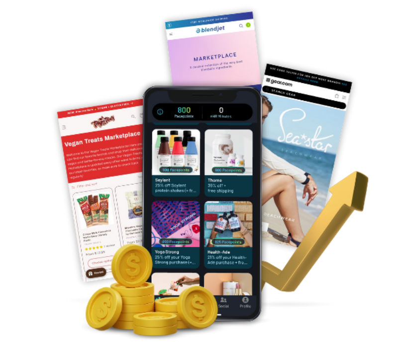
Increase revenue & source products from our robust brand network without investment in inventory or operations.
- Source thousands of products from top tier brands
-
Integrate directly to your Shopify storefront
- Lower acquisition costs
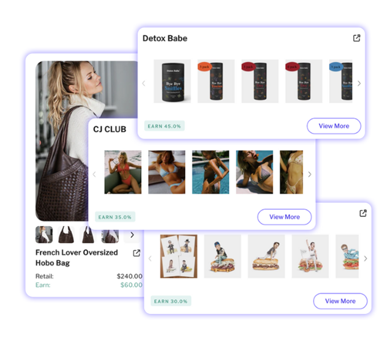
Are you a Supplier looking to connect with premium online shops?
-
Gain access to thousands of potential partners
-
Utilize a full integration with Shopify
-
Sell products at no cost to you!
Who is Carro?
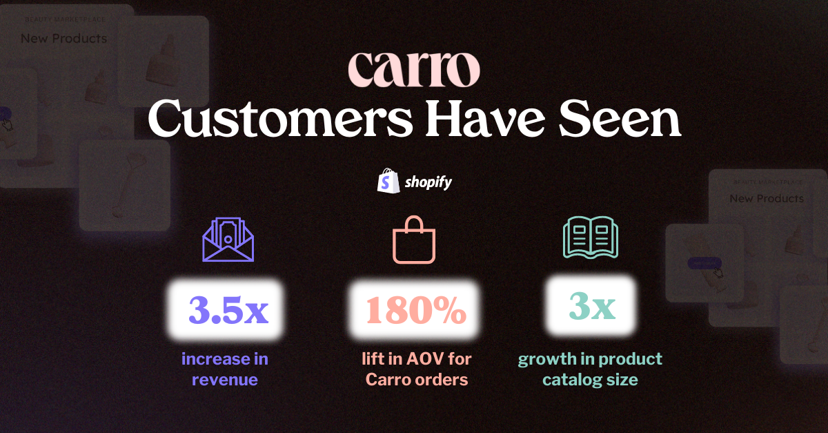
Carro connects you to Thousands top DTC brands, Hundreds of thousands of products, and over 85 Million unique shoppers unlocking endless new sales opportunities for you.
FAQs
Will Abound suppliers & retailers automatically be a part of Carro now?
No, interested partners will have to join. Sign up is quick and easy!
How does Carro work for Suppliers?
Suppliers download the app, integrate their Shopify catalog, choose which products they want to sell & then choose various customizations including margin, pricing limitations, etc. Checkout a step-by-step guide on how to setup here.
How does Carro work for Retailers?
Retailers download the app, add information about their business and then begin browsing thousands of brands and products to add to their online storefront. Checkout a step-by-step guide on how to setup here.
Is Abound going away?
Abound will now be merging into the Carro platform. This means that all selling will now be done via Carro (if Abound partners choose to join.)
How long does setup take?
If you use Shopify for your ecommerce platform, setup can be as quick as 5-10 minutes.
Have more questions about Carro? Checkout our full help center here!
You can also reach us as support@getcarro.com
"We're thrilled to welcome Abound and Droply into the Carro family. This acquisition is more than just an expansion of our capabilities—it's a reinforcement of our commitment to foster genuine partnerships and create a more collaborative e-commerce environment..."